not 10 days ago meisterluk posted a graph of relationship data he collected watching The Big Bang Theory .
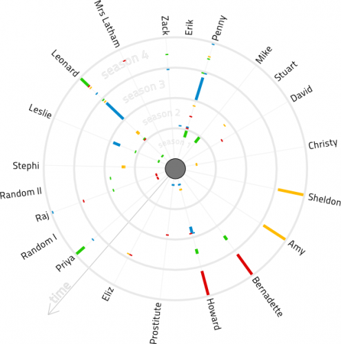
i was not quite happy with his visualization. so i redid it, here it is:

i hope it is self explanatory. in case it is not, here is how it works: the series starts in the center of the circle. each season has a ring around the center (season 4 on the outside). in case of a relationship (relationship, sex) between characters there is a line for each character which corresponds in color between the characters. e.g. Shelodon and Amy have a long relationship in season 4. the shortest lines are relations that only occur in one episode. double colored lines show a dual relation for that character.
let me know what you think in the comments.
i’m mirroring the data here (actually it corrects missing entries i found too).
edit 110702: there was an error in the dataset. i corrected that and updated the graphic (v1.2)
edit 110707: there was another missing entry in the dataset. i corrected that and updated the graphic (v1.3)
4 replies on “Big Bang Theory Relationship Diagram…”
Cool, I’m impressed. More beautiful and self-explanatory than mine 😉 Which software did you use?
handcrafted in inkscape. danke für die blumen 🙂
Oh, I have to improve my skills. Did it in Inkscape too (maybe obviously) 😉
[…] years ago I did a relationship diagram based on data collected from The Big Bang Theory TV-Series. Meisterluk updated his data for the […]