Categories
data

Hunting Network Speed

I’ve had a consumer UPC internet connection for years now. The product should deliver 75Mbit/s download and 7.5 Mbit/s upload speed.

I am monitoring the performance of my bandwidth automatically. So when UPC forced a modem ‘upgrade’ on me, I immediately knew that the performance of my connection dwindled. That was at the end of January 2018. A, until then, somewhat decent bandwidth of an average of 71 Mbit/s came down to about 40 Mbit/s.

The old cable modem was a modem only device. It was black and wall-mountable. The new modem is a white designer piece and offers full router and WiFi capabliliy. It is not wall mountable and that is slightly impractical. But I am using this WiFi capable cable modem as modem only. There is a setting that allows simple modem use, which disables all WiFi and smart-router features. I’ve my own router behind it.

The performance issues are clearly visible, after the modem has been switched at the end of January 2018

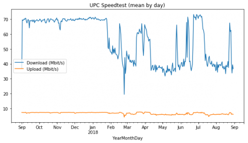
The graph clearly shows the drop in performance after the modem ‘upgrade’. One can only speculate what the reason for a little recovery in July is. In July of 2018 the performance came back – which could be due to less usage in the network, as it coincides with school holidays. I do have no proof for that though.

The speed drop is nicely seen in a heat map that plots speed by hour of the day over months.

As the speed did not improve, even after hours spent with the hotline, and multiple resets and even an active cooling attempt – I opted for another modem switch. Same type of modem – but I switched everything: modem, power supply, cables etc. This was at the beginning of December 2018.

It had no effect.

Not even actively cooling the modem did help.

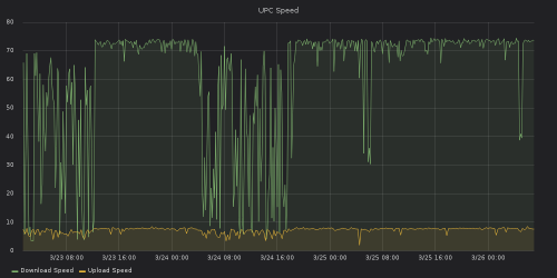
To make things worse, the modem worked fine for about 12-18 hours after a power cycle. So the hotline would tell me to power-cycle the modem and connect my laptop directly to it, to test for speed. Of course it worked fine then:

classic manual power cycle at the start at 12:00, after that a stable connection for 16 hours, then an instable connection. Another manual power cycle the next day at 19:00. The firmware upgrade happened at March 25th at 12:00.

I kept mentioning the issue to a friend, who has connections to T-Mobile (UPC). He mentioned that it might not be a hardware but a firmware problem. Why the support hotline didn’t know that I will never know. I opted for a firmware update of the modem – and voilà – the connection is where it should be:

Download and upload-speed from January 2018 to Beginning of April 2019
Heatmap of Downloadspeed from January 2018 to Beginning of April 2019

It seems UPC has been distributing modems with (ancient) firmware (April 2017), that don’t fit their infrastructure any more. And instead of pushing a new working firmware to new modems, they swap brand new modems and keep customer satisfaction artificially low.

I’m happy the issue is solved now. But I’d rather spend less time debugging issues that my provider should fix on it’s own. I can’t wait for legislation that would allow customers to run their own modems!

You can find my data analysis for this blog post here (2017-09 to 2018-08) and here (2018-01 to 2019-04).

Categories
data Software

Fail2ban country statistics…

I was lucky enough to seize a “Raspberry Pi Colocation“-slot for my Raspberry Pi.

To secure it further I just recently installed fail2ban.
The software basically detects login attempts and blocks the IP for some limited time in the future. This prevents a depletive password guessing for server logins.

I was interested in the password-guessers` country of origin. Now I can confirm, at least for my Raspberry Pi, that most attacks come from China.

1
2
3
4
5
6
7
8
9
    110       CN
      2       UA
      2       RU
      2       DE
      1       VN
      1       PE
      1       KR
      1       CZ
      1       BD

the quick and dirty command for this looks like this: (you need to have ‘whois’ installed)

1
2
3
4
for i in `sudo cat /var/log/fail2ban.log | sed 's/.*[Bb]an \(.*\)/\1/' | sort | uniq | cut -d ' ' -f 1 | grep "\."`; do
  echo $i; whois $i | grep country\: |head -n 1 >> fail2ban_ctry.log ;
done
cat fail2ban_ctry.log fail2bancry2.log | sed 's/country:  //g' |sort | uniq -c |sort -nr
Categories
data english Hacking

Open Street Map RL Wallpaper…

The final result
The final result

We wanted to paint one wall in our vestibule to add a little more color to the room. As we could not settle on a specific color, I thought of wallpaper. And is there any better theme than OpenStreetMap Data¹?

 
The theme was settled. It had to be a map, but which tiles? I thought of the beautiful pencil drawn MapBox tiles I saw some time ago:

OpenStreetMap Pencil Tiles by MapBox

We wanted some redish color so I had to convert the image with ImageMagick:

1
2
$ ./colorize.sh 25 file_in.png file_out.png
$ cat colorize.sh
#!/bin/bash
# I found this script in the imagemagick formus:
# http://www.imagemagick.org/discourse-server/viewtopic.php?t=17460#p91820
# It does about the same as gimp with the colorize option.
test -z $1 && exit -1

hue=$1
sat=50
light=0
hue=`convert xc: -format "%[fx:100*$hue/360]" info:`
sat=`convert xc: -format "%[fx:2*$sat]" info:`
test=`convert xc: -format "%[fx:$light<0?0:1]" info:`
light=`convert xc: -format "%[fx:abs($light)]" info:`
if [ $test -eq 0 ]; then
fillcolor="black"
else
fillcolor="white"
fi

convert \
$2 -set colorspace RGB -colorspace gray -set colorspace sRGB \
-fill "hsl($hue%,100%,50%)" -tint 40% \
-modulate 100,$sat,100 \
-fill $fillcolor -colorize $light% $3

the result is something like this:

Categories
data english

Big Bang Theory Relationship Diagram Update…

Two years ago I did a relationship diagram based on data collected from The Big Bang Theory TV-Series. Meisterluk updated his data for the seasons 5 and 6.
Obviously I had to update my diagram, which I finally had time to do. Here it is:

Big Bang Theory Relationship Diagram

It is only based on the data regarding dating and sex. The little mistakes I found in Meisterluk’s data i corrected again and am mirroring the corrected data here.

What did I change for the new version 1.4, since the last version 1.3 from 2011? I moved the names into the circles to keep it more compact. I changed the position of the timeline and moved some characters around for readability.
The basic concept is the same as in v 1.3. Characters that share the same length and color line on the radial timeline in the same radial distance have a relationship (date/sex). That’s it.
One can clearly see that Leonard and Penny have an on-and-off relationship. Which they finally pick up again in season 5. Sheldon and Amy, and Howard and Bernadette have the two stable relationships in the group. Their relationships go on for almost 3 seasons now.
Raj seems almost asexual if one compares his timeline. He has only one sexual encounter per season. I did not count the ‘dating’ Raj did with Siri as it is a computer voice. At the end of season 6 Raj finally picks up a relationship with Lucy. Let’s see where this ends in season 7.

Categories
data english

Big Bang Theory Relationship Diagram…

not 10 days ago meisterluk posted a graph of relationship data he collected watching The Big Bang Theory .

i was not quite happy with his visualization. so i redid it, here it is:

Big Bang Theory Relationship Diagram

i hope it is self explanatory. in case it is not,

Categories
data english

Bday Pie Chart…

having had my birthday recently i was curious about the channels via which people would wish me a happy birthday. so i counted.
and here is the resulting pie chart – what’s better than a pie chart for a birthday wish statistic?

Birthday wishes pie chart

it is not surprising that facebook has the biggest piece of the pie. people seem to like facebook, i certainly have a bigger contact list than on skype plus facebook knows my birthday and people get reminded. that sums up to a high count.
suprising for me was the second place: the telephone. it beat skype by 1.4% to the second place. it has no auto reminder and it’s the only medium that is synchronous.
third place goes to skype (just text messages) with 11.9%. fourth to SMS.
the last place is shared by twitter and e-mail. twitter is not that much of a surprise to me. on the other hand e-mail suprised me. a few years ago this statistic would have looked totally different without facebook, and e-mail would not be in the last place.

what’s your birthday wishes statistic like?